Tribe Global
When a new brand identity launches, the finished work often appears inevitable, as though it arrived fully formed. The reality is far more iterative.
Every brand is shaped through research, exploration, conversation, refinement, and a willingness to challenge the status quo. It’s a process of testing ideas, searching for new perspectives, and continually asking if each decision serves the larger story.
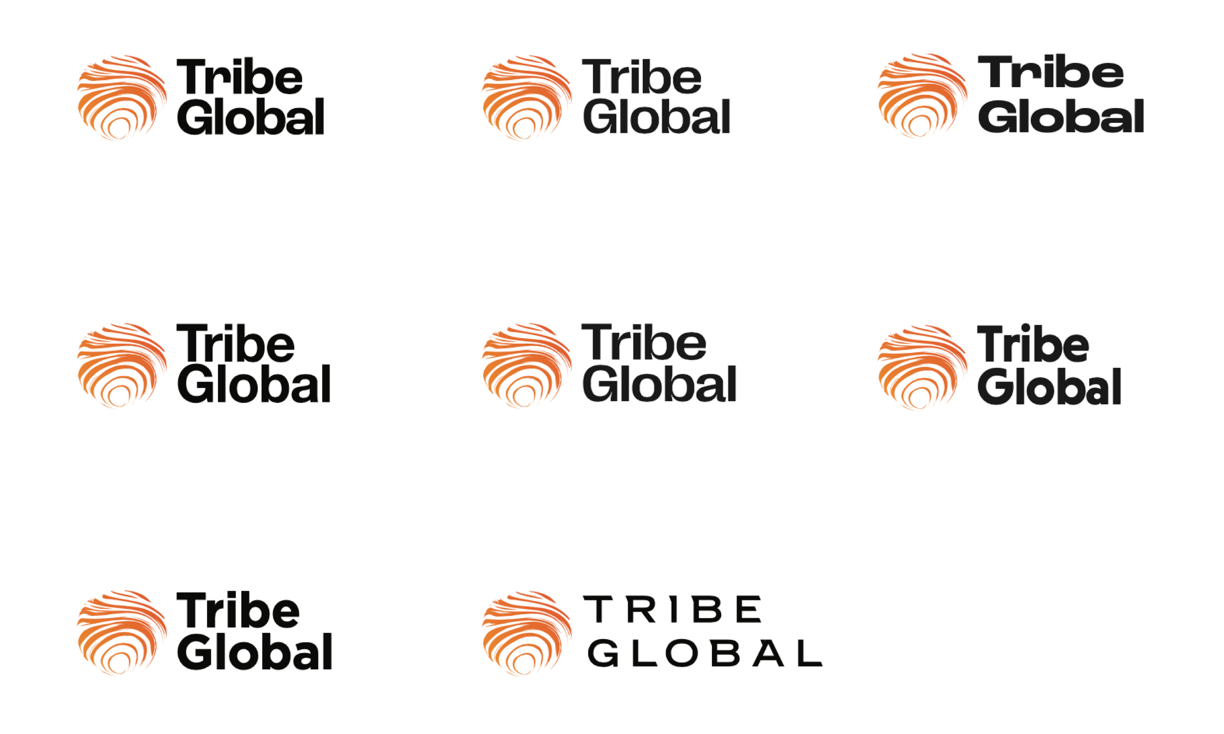
Early iterations of an unused Tribe Global logo concept.
For Tribe Global, our task wasn't to simply redesign the logo. It was to articulate the identity of a worldwide network of independent agencies while preserving the entrepreneurial spirit that made the organization unique. The final identity system is the product of hundreds of smaller decisions, many visible, but many intentionally invisible – all working together to create something that feels like an exact fit for Tribe Global.
It Starts with Questions, Not Sketches
Before any visual exploration began, we spent time understanding what Tribe Global represented to its members. Rather than beginning with aesthetics, we began with conversations.
Working alongside leadership and partner agencies, we asked questions like:
What makes this network different?What do members value most?What emotional qualities should the brand convey?Where has the existing identity stopped serving the organization?
These conversations became the foundation for every creative decision that followed. They helped define not just how the brand should look, but how it should feel: collaborative, entrepreneurial, global, and interconnected. By establishing the strategic direction first, every visual decision would reinforce the brand, rather than creating something new just for the sake of change.
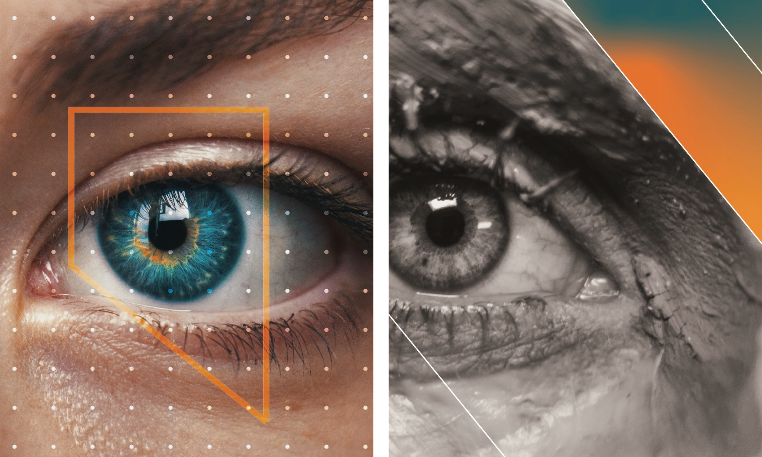
Graphic explorations for Tribe Global brand applications.
Refinement is Where the Work Happens
Rarely is the strongest idea the first one. More often than not, it’s the version that remains after everything unnecessary has been removed.
Early explorations intentionally pushed the identity in several distinct directions. Some leaned into the international nature of the organization. Others emphasized collaboration through abstract forms. A few explored more restrained systems before we began to gravitate toward a more energetic visual language.
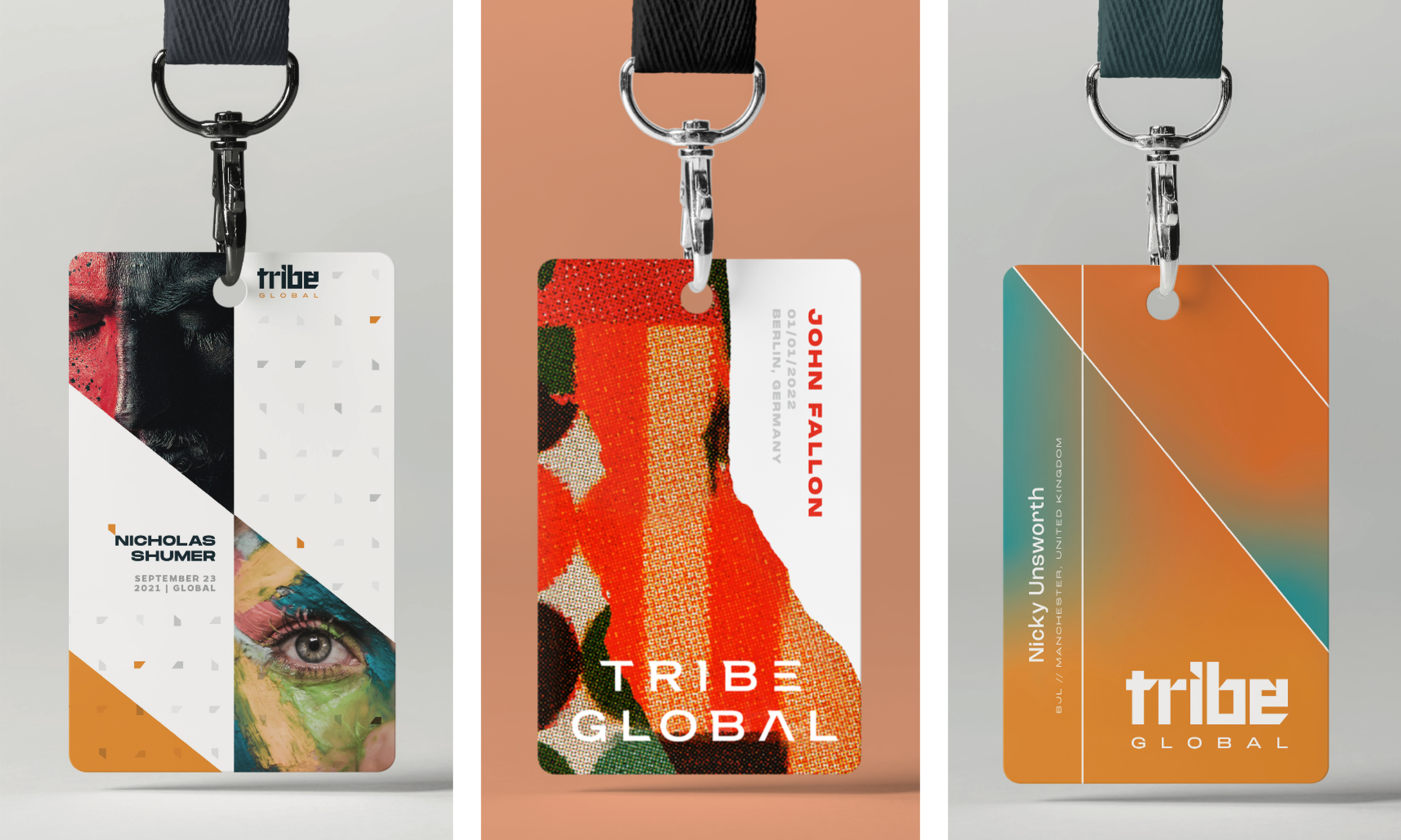
Three brand application directions for Tribe Global ID badge designs.
Each round of exploration revealed something valuable, even when it wasn’t the final answer. Feedback wasn’t viewed as a constraint, but as another layer of insight that helped clarify where the brand was headed. Through repeated refinement like adjusting proportions, simplifying forms, and testing applications, the identity became stronger, more flexible, and more distinct to Tribe.
Building a System, Not Just a Logo
A successful identity needs to do more than just create recognition, it needs to create consistency. For a global network like Tribe, the brand had to perform across a wide range of organizations, cultures, and communications while still feeling unified.
The visual language extends far beyond the mark. Tribe’s geometric forms, expressive textures, typography, and collateral applications work together as a cohesive system rather than relying on the logo alone. Each element was designed to support the others, creating a flexible toolkit that could evolve with the organization.
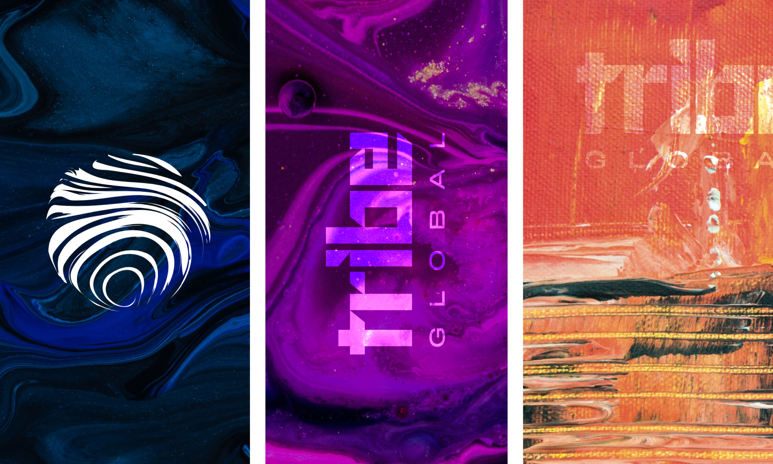
Texture explorations for the Tribe Global brand toolkit.
Every identity is shaped by dozens of conversations, countless iterations, and hundreds of small decisions. The finished work is simply the piece the world gets to see.
Curious how these ideas came together?
Explore the final Tribe Global identity.