In January 2021, Michelle Fields faced a routine mammogram that revealed a life-altering diagnosis: stage 1 Invasive Ductal Carcinoma breast cancer, which had spread to her lymph nodes. Over the next 18 months, she endured 16 rounds of chemotherapy, a bi-lateral mastectomy, 25 rounds of radiation, reconstructive breast surgery, and a preventative hysterectomy. Michelle's resilience and courage saw her through these treatments, leading her into remission. During her battle, friends and family often struggled to find ways to offer meaningful support. This insight led Michelle to create Squash Cancer.
-
Squash Cancer
Squash Cancer, developed by Michelle Fields, a breast cancer survivor, is a mission-driven gift business designed to provide comfort and inspiration to cancer patients with carefully curated gifts, including warm blankets, soothing skincare products, inspirational books, and uplifting products, each selected to ease the emotional and physical toll of cancer treatments. Led by Michelle, Squash Cancer is also a movement to support and nurture the people we care for by providing solace to those fighting cancer and enriching their lives with inspiring and comforting gifts. We aim to strengthen the bonds between families and friends and build a community that inspires and uplifts cancer patients and their loved ones.
-
To help Michelle realize her dream of creating a brand that meaningfully connects with people and supports cancer awareness, patients, and recovery. As the creative partners, our challenge was creating an empathetic, hopeful, and optimistic brand that was approachable. It needed to balance being sensitive and thoughtful yet stylistic and connect with people of all ages.
-
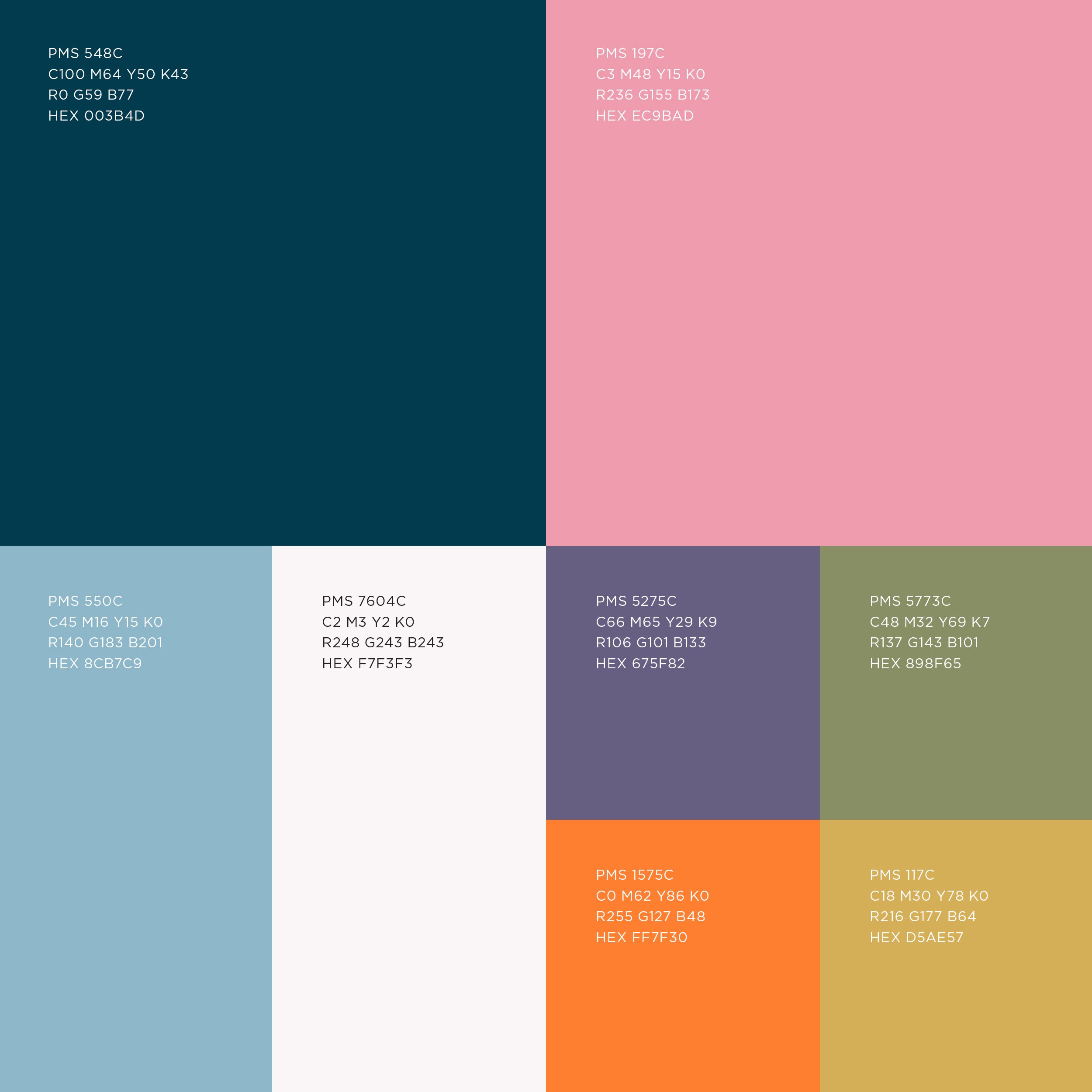
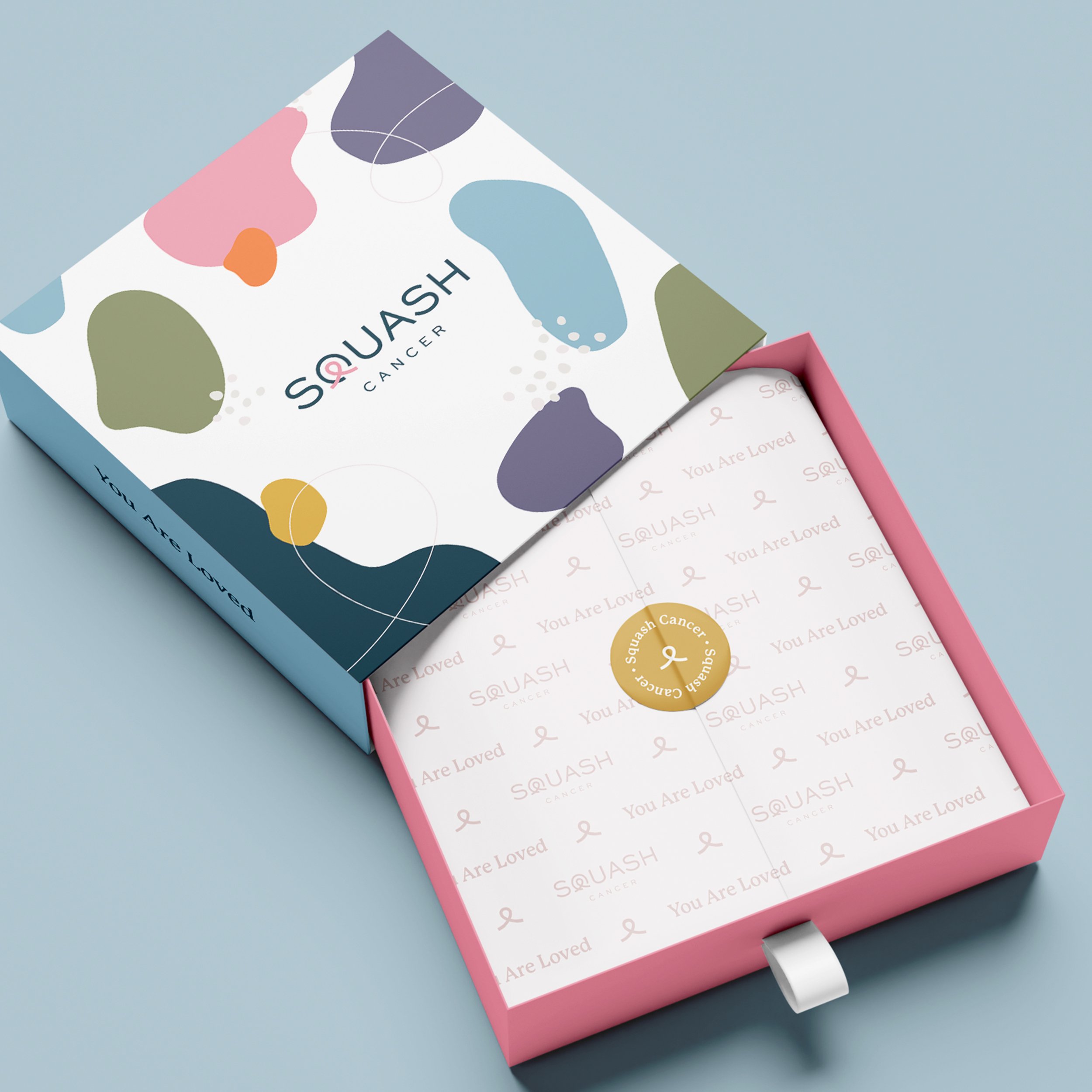
Our approach to creating an inclusive brand identity included embracing a colorful palette representative of the ribbons for various types of cancer. It was important for the visual identity to tell a story and amplify the brand strategy. We built patterns and shapes to help tell a beautiful, interconnected story of the patient, process, and community. The organic shapes featured in the design depict how family, friends, and communities take shape in all different forms growing around us as our journeys evolve. A skinny ribbon weaving through the amorphous shapes connects patients to their communities and support systems. This detail pays respect to the infinite connection between loved ones.
-
Brand Strategy
Logo Design
Verbal Identity
Visual Identity
Messaging


A TRULY WONDERFUL CAUSE
If you have a loved one that you would like to support or you would like to learn more about Squash Cancer, please visit:


